The Problem: PMO Dashboards Try to Do Too Many Jobs
Most PMO dashboard templates look impressive at first. They include status colors, milestone tables, risk lists, issue logs, action trackers, decision registers, budget summaries, dependency maps, owner columns, due dates, variance notes, KPI sections, and dozens of bullets across multiple areas.
The problem is that most of this information is not wrong. It is just presented at the wrong level for executive stakeholders.
Executive meetings are not designed to review every project detail. They are designed to create alignment, resolve the right issues, confirm priorities, and make decisions that affect project or portfolio success. When a PMO dashboard tries to show everything at once, it creates cognitive overload. Leaders spend time interpreting the dashboard instead of discussing what actually matters.
That is why many PMO dashboards fail in real executive meetings. They contain too much information, mix too many reporting purposes, and force executives to decode operational detail instead of seeing the big picture.
In addition to mixing too many reporting purposes into one page, many PMO dashboard templates create ambiguity through unnecessary sections such as “Items for Executive Attention,” “Management Attention Required,” or “Key Callouts.” These sections often repeat or compete with the executive summary instead of strengthening it.
That creates a problem. The executive summary should already tell the storyline: where the project stands, what changed, why it matters, and what requires attention. If the important message is placed somewhere else, the report forces leaders to assemble the story from disconnected sections.
A strong executive update should not separate the storyline from the items that matter. It should connect status, progress, top issues, top risks, and next goals into one clear leadership narrative.
A PMO dashboard often fails because it tries to combine several different tools into one page.
The result is not a better executive update. The result is a crowded page with too many competing signals.
A status report has one purpose: to communicate where the project stands and what leadership needs to know. A RAID log has a different purpose: to track risks, actions, issues, and decisions in a structured way. A decision log tracks what was decided, who approved it, and what follow-up is required. A budget dashboard explains financial performance. A roadmap shows where the initiative is going over time.
When all of these are compressed into one page, the executive update loses focus. The meeting shifts from “What do we need to know or decide?” to “What am I looking at?”
The Root Cause: Reporting Is Built Around Data Collection, Not Executive Consumption
Many dashboards are built from the PMO’s internal data structure. The template mirrors what the project manager tracks behind the scenes: risks, issues, dependencies, actions, milestones, owners, due dates, budget fields, variance notes, and task progress.
That information is important. But executive communication requires translation.
Executives do not need to see every field the project manager uses to manage delivery. They need a clear view of project health, progress, next priorities, risks that matter, issues that require attention, and decisions that may affect success.
This is where many dashboards fail. They confuse completeness with usefulness. They assume that more fields create better transparency. In reality, more fields often create more noise.
What a Typical Executive Status Report Should Include
A practical executive status report should provide a big-picture view of the project. It should be concise, structured, and easy to scan. It should not require executives to study the page for several minutes before understanding the message.
The strongest executive status reports usually include six core areas: executive summary, overall project health, progress, next month goals, KPI health, and top issues/top risks.
Executive Summary
The executive summary should explain the current project position in plain language. It should answer what changed, why it matters, and whether executive attention is required.
This section is important because it frames the entire report. If the summary is unclear, the rest of the dashboard becomes harder to interpret.
A good executive summary does not repeat every update. It translates the project’s current position into leadership language.
Many templates weaken this section by combining the executive summary with vague labels such as “Items for Executive Attention,” “Management Attention Required,” or “Key Callouts.” This creates another layer of ambiguity.
If the executive summary is doing its job, it should already tell the storyline and include the items that require attention. Otherwise, there is little reason to keep an executive summary at all.
The better approach is to make the executive summary the storyline. If something requires executive attention, it should be reflected clearly in the summary and then supported by the appropriate section, such as top issues, top risks, KPI health, timeline status, or decision discussion.
Overall Project Health
Executives need to know whether the project is on track, at risk, off track, complete, or not started. This should be visible immediately.
RAG indicators are useful when they summarize meaning, not when they decorate the page. A green, amber, or red status should reflect an actual assessment of schedule, budget, scope, risk, and delivery confidence.
The project manager should review the detailed variances behind the scenes. The executive report should present the conclusion clearly.
For executive audiences, the main question is not whether every metric moved slightly. The question is whether the project is still healthy, whether the timeline is credible, whether budget or scope concerns are material, and whether leadership needs to intervene.
Progress and Next Month Goals
Progress should focus on accomplishments that matter to the project outcome. It should not list every completed task.
Executives need to know whether meaningful progress is being made. That means accomplishments should be connected to milestones, readiness, business value, risk reduction, implementation progress, or stakeholder alignment.
A long activity list creates the appearance of work. A concise accomplishment section shows whether the project is moving forward.
The best progress section answers a simple question: what changed since the last update that matters to the project’s success?
A strong executive update should also show what the team is focused on next. This is one of the most important parts of the report because it helps leadership understand where the project is going.
Next month goals should not be a task dump. They should identify the few priorities that matter most before the next reporting cycle.
This section helps executives see whether the team is focused on the right outcomes and whether any upcoming work requires support, approval, or cross-functional attention.
KPIs, Budget Health, and Status Indicators
KPIs help executives quickly understand whether the project is healthy. They may include schedule, budget, scope, milestone confidence, completion percentage, financial health, or other project-specific measures.
The purpose of KPIs is not to show every calculation behind the status. The purpose is to provide a quick health view without overwhelming the audience with raw variance details, days of delay, task-level deviations, or internal project controls data.
The project manager should analyze the detail behind the scenes and present the summary in a way that supports understanding and action.
This is especially important for budget. Project budget is always a sensitive topic. That is why budget should be handled carefully in executive reporting.
Many dashboards try to place every budget metric, variance, forecast number, remaining spend, cost pressure, and financial note onto one page. This can create confusion or unnecessary alarm, especially when the audience does not have the supporting context.
For executive updates, a RAG-style financial health indicator is often more practical than placing every budget detail on the main status page. The project manager or PMO can review the detailed numbers behind the scenes and summarize the result as green, amber, or red based on the actual financial condition of the project.
If detailed budget discussion is required, it should be handled with a backup dashboard, financial appendix, or follow-up meeting with the right audience. Not every executive stakeholder needs the same level of budget detail in the main status update.
Top Issues and Top Risks
Issues and risks matter, but they need to be handled carefully in executive reporting.
A top issue is something already affecting the project. A top risk is something that could affect the project if it is not managed. Both should be included only when they are material to project success, delivery confidence, business impact, or executive decisions.
The status report should not include the full issue log or full risk register. It should highlight the few items executives need to know about.
This is where many dashboards become confusing. They list schedule variances, budget variances, resource variances, or scope variances with several notes, but they do not clearly answer the executive question: is this an issue, a risk, or just something being monitored?
A variance by itself does not always tell the executive audience what to do with the information. It may be an observation, an issue, a risk, or a signal that requires no immediate action.
If a variance is being monitored but does not affect the project outcome, it may not belong on the executive page at all.
This is the difference between data reporting and executive communication. The project manager should interpret the variance before the meeting and present the meaning, not simply display the raw deviation.
Why Mixing Status, Decisions, Actions, Issues, and Risks Into One Page Often Fails
It may seem efficient to put everything on one page: status, decisions, actions, issues, risks, owners, due dates, budget, metrics, milestones, and next steps.
In practice, this often creates a weak executive update.
The reason is simple: each type of information requires a different level of attention.
When all of these are mixed together without hierarchy, the page becomes difficult to read. Executives cannot quickly separate project health from follow-up tasks, risks from issues, decisions from actions, or operational detail from leadership signal.
This creates two problems. First, the status report becomes overloaded. It starts looking like a project manager’s working document instead of an executive update.
Second, important items lose visibility. A decision that requires leadership attention may be buried next to routine action items. A major risk may sit beside low-impact issues. A project health signal may be diluted by too many bullets.
The Better Strategy: Separate the Big Picture From the Supporting Detail
The optimal strategy is to use the status report for the big picture and use supporting dashboards for the detail.
The executive status report should show current project health, major progress, next month goals or upcoming priorities, key KPIs with RAG status, top issues, top risks, and timeline or milestone confidence. That is enough to support executive understanding without overwhelming the audience.
Then, if more detail is needed, it should live in the right supporting artifact.
Executive proposals should explain scope, benefits, assumptions, dependencies, risks, and approval logic before the project begins.
This approach creates a clean reporting system. The executive status report becomes the front page. The supporting dashboards provide the drill-down detail when needed.
What Executives Actually Need in the Meeting
Executives do not need a report that proves the project manager knows every detail. They need a report that helps them understand the situation quickly.
They need to know whether the project is healthy, what changed since the last update, what progress matters, what the team is focused on next, what could affect delivery, what requires leadership attention, and whether the next milestones are still credible.
This is the executive lens. It is not about reducing transparency. It is about presenting information in a way that supports decision-making.
A dashboard that creates too much detail can actually reduce transparency because the important message becomes harder to find.
The PMO Reporting Mistake: More Detail Feels Safer, But It Creates More Noise
Many project managers and PMOs add more fields because they want to avoid missing anything. They believe a more detailed dashboard will be more complete, more defensible, and more useful.
But in executive meetings, more detail often has the opposite effect.
More variance notes can create unnecessary alarm if the report does not explain whether the variance is material, whether it is already an issue, whether it is a future risk, or whether it is simply being monitored.
The strongest executive reporting is not the most detailed. It is the clearest.
A good PMO dashboard helps leaders see the project position without forcing them to reconstruct the project story from raw details.
Staggered Reporting Is Better Than One Overloaded Dashboard
The stronger PMO reporting strategy is not to force every type of information into one dashboard. The stronger strategy is to use a staggered reporting system with separate templates for separate purposes and audiences.
This separation is important because different stakeholders need different levels of information. Executives need the big picture and decision context. Project managers need detailed control data. Teams need actions, blockers, and near-term priorities. PMOs need governance visibility across multiple projects.
Trying to satisfy all of those audiences with one overloaded dashboard usually creates cognitive overload. A staggered reporting system creates clarity because each artifact has a clear purpose.
Summary: A PMO Dashboard Should Create Executive Clarity
Most PMO dashboard templates fail because they are designed as information containers instead of executive communication tools. They capture many types of project data, but they do not always organize that data into a clear leadership story.
A strong executive update should provide the big picture without cognitive overload. It should show current status, progress, next month goals, KPI health, top issues, top risks, and timeline confidence. It should help leaders understand what matters and where attention may be required.
The status report should not try to replace the RAID log, decision log, action tracker, budget dashboard, roadmap, or project plan. Those tools still matter, but they should support the executive update rather than compete with it.
That is how executive meetings become more focused, more productive, and more decision-oriented.
Why Tuplebits Templates Solve This Problem
Tuplebits templates are designed around the idea that executive reporting should support decisions, not create more reporting noise.
The recommended starting point for this reporting problem is the Executive Project Status Report Bundle. It is designed as a focused three-template reporting set: an Executive Status Report, a Decisions & Actions dashboard, and an Issues & Risks dashboard.
This matters because one slide should not be forced to carry every reporting purpose. The status report should provide the big picture: executive summary, progress, next goals, KPI health, top issues, top risks, and timeline visibility. The Decisions & Actions dashboard should handle follow-up and leadership decisions. The Issues & Risks dashboard should separate current problems from future exposure.
For teams that need supporting detail, Tuplebits offers a staggered reporting approach with separate sets of templates for different purposes and audiences.
The Project Budget Status Report is also available as a standalone listing for budget-focused leadership updates. When more financial context is needed, it can be used as a focused backup view instead of forcing detailed budget variances into the main executive status report.
For buyers who need the full reporting system, the Executive Project Status Report Bundle, Project Budget Status Report, roadmap, RAID, and related one-page executive reporting products are included in the Executive PM Reporting Toolkit — the Tuplebits 1 Page Executive Reporting System.
This separation is what makes the reporting structure more useful. It gives executives a concise view of the project while still giving project managers, consultants, and PMOs the tools they need to manage the supporting detail.
This is why the Tuplebits 1 Page Reporting System is becoming popular and trusted among consultants, PMOs, and project managers. It does not treat reporting as one giant slide with every possible field. It separates status, roadmaps, risks, actions, decisions, budgets, and proposals into focused templates designed for the right audience and the right conversation.
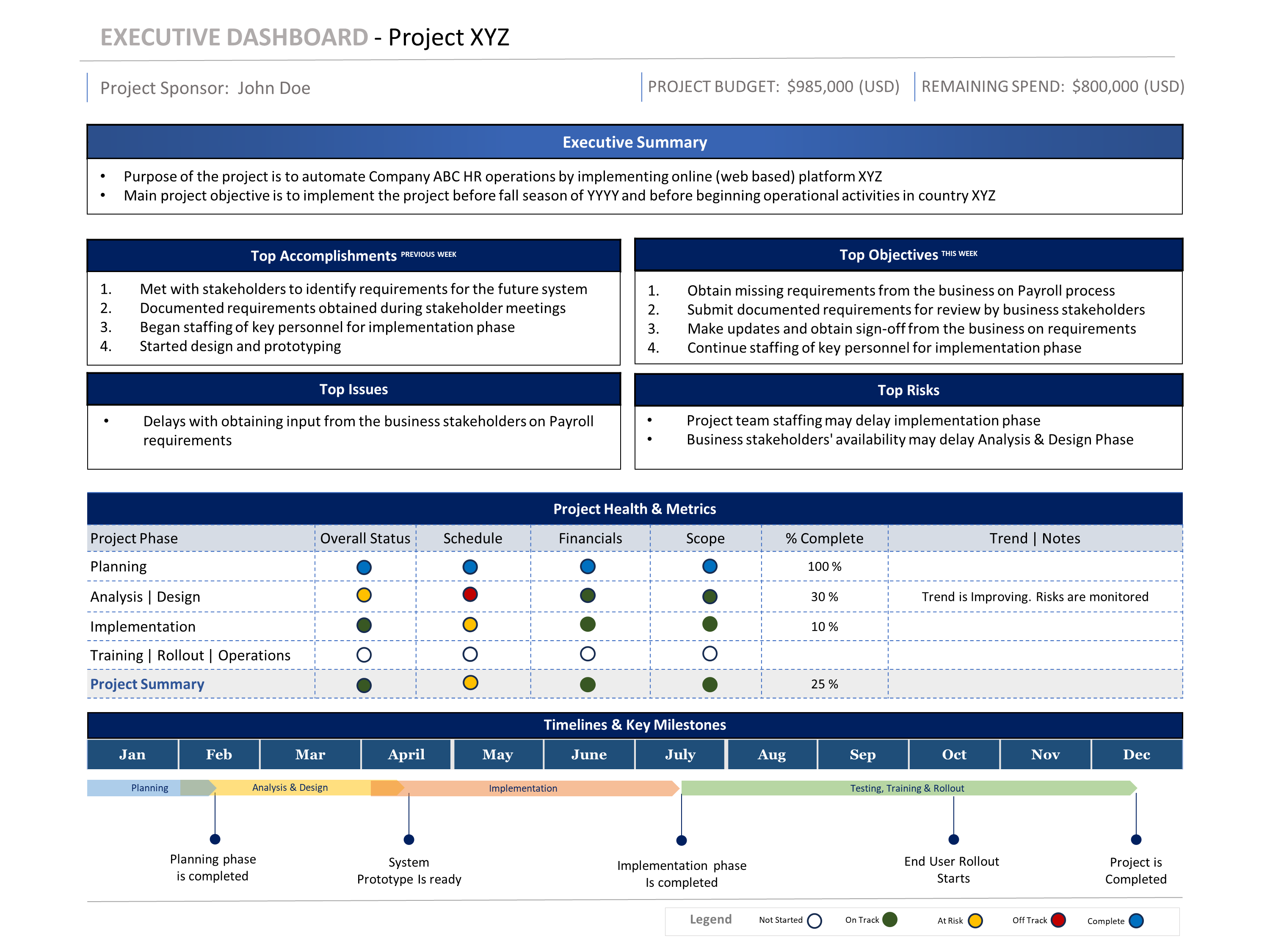
Status Report
One-page executive view for project health, progress, next goals, KPI health, top issues, top risks, and timeline visibility.
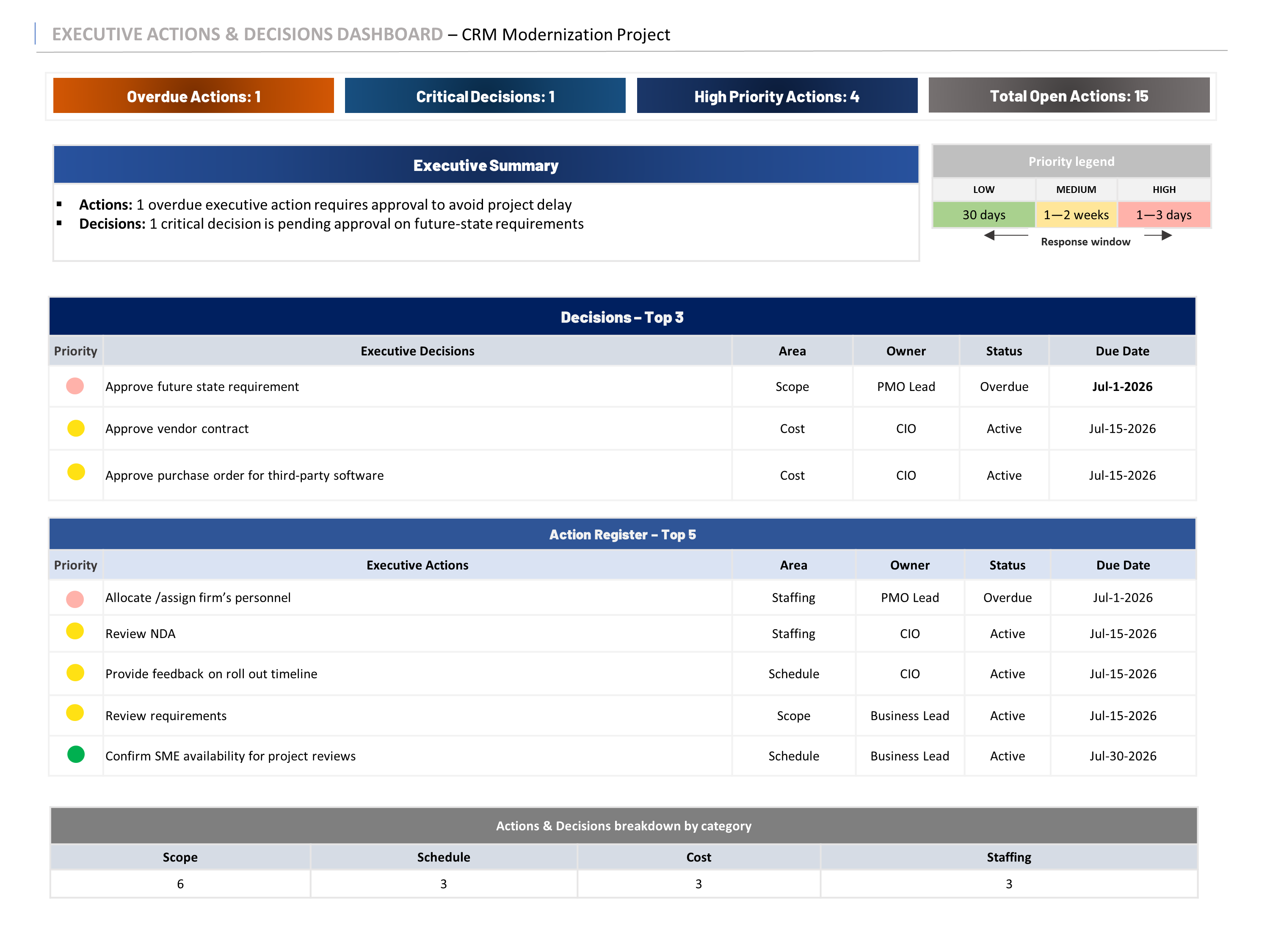
Decisions & Actions
Focused dashboard for follow-up, ownership, due dates, leadership decisions, and action visibility.
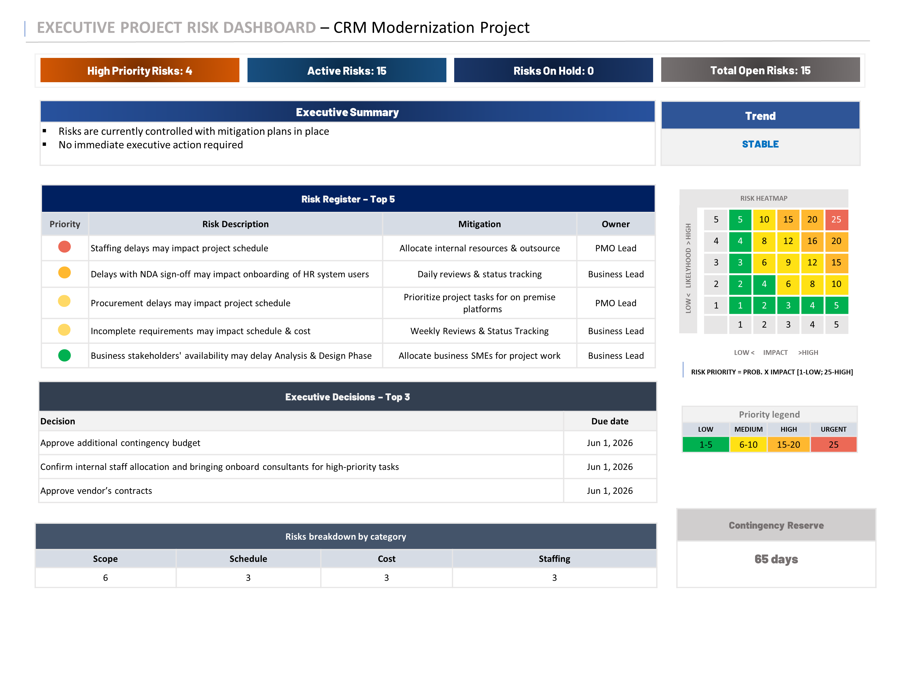
Issues & Risks
Separate view for current issues and future risks so the main status report stays clean and executive-ready.
Example: Tuplebits Executive Project Status Report Bundle uses three focused templates instead of forcing status, decisions, actions, issues, and risks into one overloaded page.
Related Templates
If you need a focused executive reporting set, start with the Executive Project Status Report Bundle. It includes three focused templates: Status Report, Decisions & Actions, and Issues & Risks.
If you need financial visibility, the Project Budget Status Report is available as a standalone listing for budget-focused executive updates. It is useful when budget needs its own focused view rather than being compressed into the main status report.
If you need to manage risks, actions, issues, and decisions in a more detailed governance view, use the RAID Management Toolkit. If you need a leadership-ready roadmap, use the Project Roadmap Template Bundle.
If you need the complete system, use the Executive PM Reporting Toolkit — Tuplebits 1 Page Executive Reporting System. It includes the executive reporting products above and brings status reports, roadmaps, budget views, RAID, org charts, and meeting reports into one staggered reporting system.
Need Executive Reporting Without Dashboard Overload?
Download a focused three-template reporting bundle built for leadership updates, PMO reviews, steering committees, and executive decision-making.
View Executive Status Report Bundle